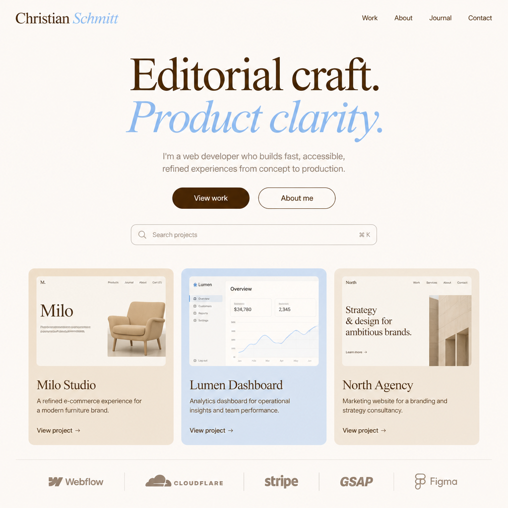
Archetype
The Editor
Curated, intentional, refined. You don't shout — you compose. Every element earns its place, mirroring how clients experience your work: deliberate, not noisy.
Editorial warmth — a personal brand built on distinctive typography, earthy tones, and calm confidence.
01 — Brand essence
This identity positions you as a thoughtful creative — someone who leads with craft and clarity. The serif carries personality; the sans-serif keeps things readable. The palette feels like quality paper, ink, and open sky.
Archetype
Curated, intentional, refined. You don't shout — you compose. Every element earns its place, mirroring how clients experience your work: deliberate, not noisy.
Emotional tone
Deep brown signals substance and reliability. Soft blue adds openness and calm. Together they say: competent, approachable, human — not cold or generic.
Differentiator
PP Editorial New is distinctive enough to be remembered after one visit (mere exposure builds preference). Helvetica stays invisible so your voice — not the typeface — does the work in body copy.
02 — Design psychology
Good branding isn't decoration — it's decision architecture. These principles explain how visual choices influence perception and memory.
Mere exposure effect
Repeated use of the same colors, type, and spacing makes your brand feel familiar and safe. Apply this system everywhere — Webflow, social, decks — so recognition compounds over time.
Von Restorff effect
Soft blue (#9EC6F1) stands out against warm cream and brown because it breaks the warm palette. Use it sparingly for highlights — one accent per viewport keeps attention focused, not scattered.
Cognitive fluency
High contrast brown-on-cream text (13.6:1) reduces mental effort. Clear hierarchy — large serif headlines, calm sans body — lets visitors grasp your message in seconds. Complexity erodes confidence.
Peak–end rule
Reserve PP Editorial New italic and soft blue backgrounds for hero lines, pull quotes, and thank-you states. People remember the peak and the ending — make those moments visually distinct.
Paradox of choice
Three core colors plus derived tokens prevent visual noise. Fewer options mean faster decisions for you and clearer signals for your audience. Don't introduce new accent colors without strong reason.
Pratfall effect
Cream backgrounds and earthy brown feel human and tactile — not sterile white and pure black. A slightly imperfect, editorial aesthetic can increase likability compared to overly polished corporate design.
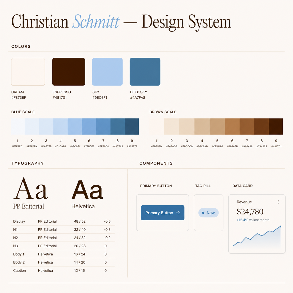
03 — Color system
Warm neutrals carry the brand. Blue provides calm contrast. On white or lighter backgrounds, always use deep sky (#4A7FA8) for readable blue UI — links, labels, icons, and chart keys. Reserve sky (#9EC6F1) for fills, washes, and wordmark italic.
#F8F3EF
Primary background. Warm cream — never pure white for full-page layouts.
#481701
Primary text, headings, strong UI. Replaces black for a softer, warmer feel.
#9EC6F1
Soft accent — tags, highlight blocks, decorative backgrounds. Not for small text on cream.
#4A7FA8
Links, buttons, interactive states. Readable on off-white backgrounds.
#6B4423
Secondary text, subtitles, supporting copy. Same family as espresso, less intense.
#E8DFD6
Borders, dividers, subtle separators. Keeps structure without harsh lines.
#2E1200
Dark sections, footers, inverted layouts. Deeper than espresso — still warm.
#FFFFFF
Cards and elevated surfaces only. Creates subtle depth against cream backgrounds.
Ton-in-ton from lightest to darkest. Step 5 is your brand sky (#9EC6F1). Step 7 is for links and CTAs. Click any swatch to copy the hex.
Warm earthy tones from cream to espresso. Step 1 matches your off-white background. Step 8 is primary text. Step 9 is for dark sections and footers.
| Token | Use for | Avoid |
|---|---|---|
| Off-white | Page backgrounds, large areas | Small text (too light as foreground) |
| Espresso | Headlines, body text, primary buttons | Large solid fills (too heavy) |
| Sky | Fills, tag backgrounds, opacity washes, wordmark italic | Text or icons on off-white, white, or light tans (use deep sky instead) |
| Deep sky | Links, CTAs, eyebrows, icons, chart keys on light surfaces | Replacing espresso for headings; large solid fills |
Any time the background is off-white (#F8F3EF), white, or a light scale step
(brown 1–4, blue 1–4), blue foregrounds must use
--color-accent-on-light (deep sky #4A7FA8). Sky blue is decorative
only — except the wordmark italic “Schmitt”, which stays sky on cream by design.
Inverted sections create rhythm and mark transitions — ideal for footers, CTAs, or portfolio case-study closings. Pair cream text with soft blue links.
Back to top →04 — Typography
PP Editorial New owns the stage at large sizes. Helvetica carries everything functional — navigation, paragraphs, labels, and UI.
PP Editorial New — Headings
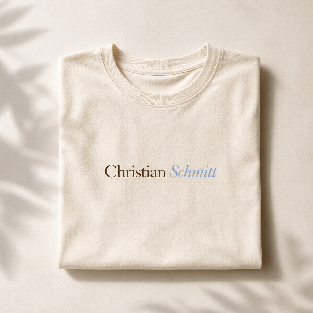
Christian Schmitt
Craft with intention.
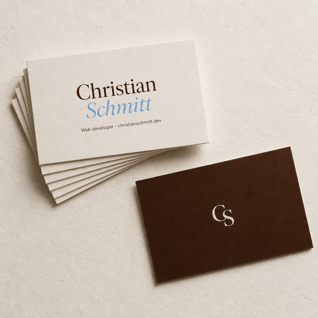
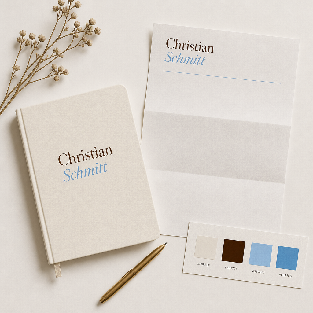
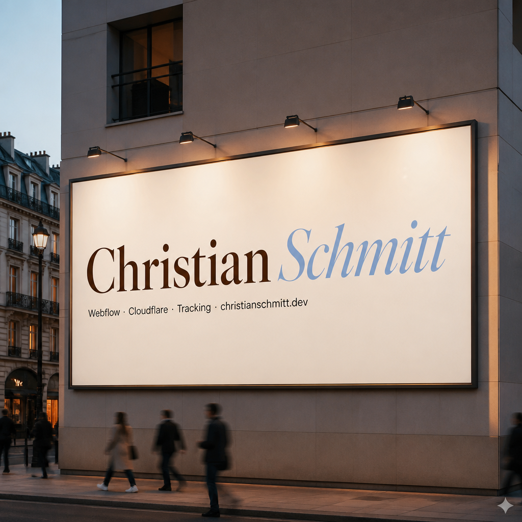
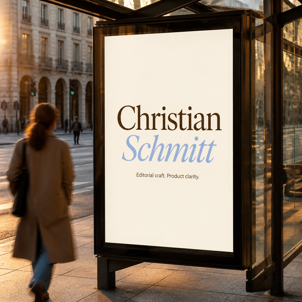
Wordmark lockup: Christian in PP Editorial New Regular (espresso). Schmitt in PP Editorial New Italic (sky blue #9EC6F1). Always keep this pairing — never swap weights or colors.
Wordmark — clear-space & sizing
Christian Schmitt
x) on every side. No graphics or copy inside that margin.CS monogram instead.Helvetica — Body (default)
I help brands and teams build digital experiences that feel considered — from Webflow sites to motion and strategy. Clear structure, warm tone, and attention to the details people feel but rarely name.
Licensed files live in fonts/helvetica/.
Use Regular for body copy, Bold for labels and UI emphasis, Light sparingly for
large supporting text. Compressed and Rounded cuts are not part of this brand system.
05 — Voice & tone
Visual identity and written voice should align. If the design feels editorial and warm, the copy should too — clear, confident, never corporate-speak.
Lead with what you do and who it's for. Wit is welcome; ambiguity isn't. Cognitive fluency applies to words as much as layout.
Short sentences. Active voice. No hype words ("revolutionary", "synergy"). Your work should prove the claim — framing effect: how you say it shapes what people believe.
Write like you speak in a good client call. Use "you" and "I". The pratfall effect: admitting limits ("I'm not the cheapest option, but…") can increase trust.
Mix sentence lengths. One-line paragraphs for emphasis. Pull quotes in PP Editorial Italic for moments that deserve to be remembered (peak–end).
05b — Copy (DE)
German site copy follows christianschmitt_strategie_v2.pdf (Persona A first).
Operative module logic (Setup/Care): strategy/package-system-2026.md.
Performance · Security · Tracking · SEO · Paid Landing Pages. Fundament is always Webflow + Cloudflare. Performance is the entry module.
Every module has two stages only: Setup (one-off build, audit, implementation) and Care (ongoing monthly). No third label, no cute tier names.
When Care needs depth, use a functional suffix after an middle dot:
Performance Care · Monitoring (Core Web Vitals, reports, alerts, from ab 490 €/mo)
Performance Care · Optimierung (monitoring + active Cloudflare work, from ab 990 €/mo)
Performance + SEO Care (Optimierung + crawl policy, llms.txt, schema, from ab 1.490 €/mo)
Headline patterns (DE)
Keyword + outcome: Webflow Performance optimieren: Core Web Vitals stabil halten.
System: Webflow + Cloudflare als System. Performance, Security, Tracking, SEO.
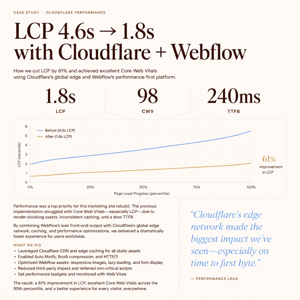
Proof: LCP 4,6s → 1,8s, danach 6+ Monate stabil.
Full messaging reference: strategy/messaging-customer-de.md
06 — Brand assets
Square 1:1 visualizations — digital product UI and physical applications — to see how the identity holds up beyond the screen.
The wordmark as it lives on paper — boutique stock, restrained color, and tactile materials that match the on-screen palette.
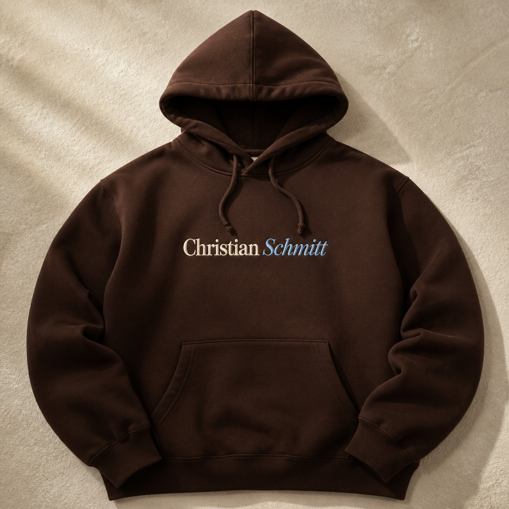
Billboards, street posters, and merch — same wordmark rules, scaled for impact in the real world.
07 — UI style lab
Like uicolors.app — same card layouts, but with your real fonts: PP Editorial New on display headlines, Helvetica on UI labels and body. Switch layout and theme to preview in context.
Editorial
craft
18
Webflow
builds
6 live
| Webflow | 3 projects | |
| Cloudflare | 2 projects | |
| Tracking | 1 project |
Cloudflare caching rules for Webflow
Performance
GTM data layer blueprint for Webflow
Tracking
GSAP scroll motion that feels intentional
Motion
Product
clarity
Brand
guidelines
Christian
Schmitt
Editorial
warmth
in every launch.
Portfolio
2.0
Ship GSAP hero for Portfolio 2.0
TodayConfigure Cloudflare caching rules
TomorrowFinalize brand guidelines UI lab
In 2 days98 ↑
Green scores after Cloudflare + Webflow passChristian Schmitt
Web development · DACH
Webflow-native builds, Cloudflare performance, and tracking that stays GDPR-clean — messbar schneller, sauber getrackt.
Active projects
Webflow · Cloudflare · Stripe
Webflow
Cloudflare
LCP 4.6s → 1.8s after caching pass
View caseTracking
GTM
sGTM
“Christian brought editorial warmth to our product UI without sacrificing clarity — the site finally feels like us.”
Brand tokens, Webflow components, Cloudflare rules — ready for your next launch.
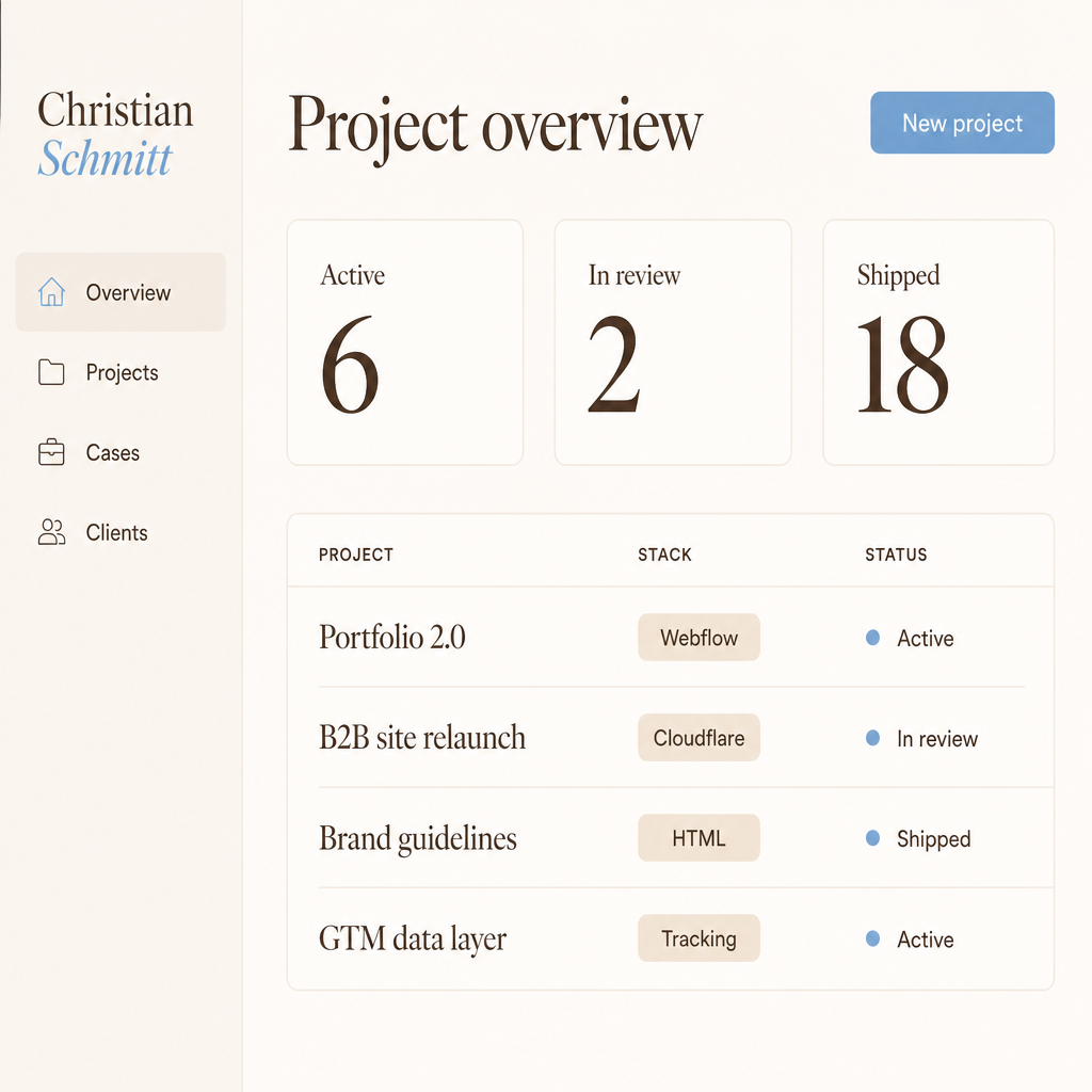
Active
6
In review
2
Shipped
18
| Project | Stack | Status |
|---|---|---|
| Portfolio 2.0 | Webflow | In progress |
| B2B site relaunch | Cloudflare | Review |
| Brand guidelines | HTML | Shipped |
| GTM data layer | Tracking | Shipped |
Buttons
Input
Tags
Notifications
Project updates
Pull quote
Personal, not corporate.
Webflow, Cloudflare & tracking — messbar schneller, sauber getrackt
Christian Schmitt
Christian Schmitt
Work · Services · Cases
Christian Schmitt
Christian Schmitt
Christian Schmitt
Webflow · Cloudflare · GTM · GSAP
CS
08 — UI components
Reusable patterns for Webflow, decks, and marketing pages. Buttons use scale(0.97) on press — small feedback that confirms interaction without distraction.
Card padding
Cards share one inset system on the 8pt grid — values scale fluidly with
viewport and preview frame width. Set padding on the card shell, not on
display headlines like .pv-ui-card__display, so photo, title,
and metrics stay aligned at every size.
| Token | Value | Use for |
|---|---|---|
--card-padding-lg |
16–24px fluid | Media cards, marketing cards, nav glass, featured blocks |
--card-padding |
12–16px fluid | Data cards — head, metrics, lists, spark rows |
--card-padding-sm |
10–12px fluid | Compact footers, chart month labels |
--card-gap |
10–12px fluid | Photo → display headline, vertical rhythm inside a card |
--card-gap-sm |
6–8px fluid | Label → metric in card headers |
--card-grid-gap |
10–12px fluid | Gap between cards in masonry / grid layouts |
Tags
Card · lg inset (fluid)
Case study
Warm typography and restrained color lifted conversion while keeping the brand feel personal.
Links
Inline links use deep sky (#4A7FA8) for accessibility. Hover shifts to a lighter blue — instant feedback, ease-out timing.
09 — Usage rules
Constraints protect the brand. Following them keeps every touchpoint reinforcing the same memory — the foundation of recognition and trust.
--card-padding-lg (16–24px fluid) on all sides--card-padding (12–16px fluid) — align content to one inset